
Our Branding Projects

Ching Jung Mom

Superior Fire
.png)
Lash Habit Academy
.png)
Guidance through Grief
Our Branding Case Studies
.png)
Ching Jung Mom
Chin Jung Mom, a Korean mom postpartum care company, approached us to develop a logo for their special event celebrating diversity and inclusivity. Our challenge was to create a design that reflects the rich cultural heritage of Korea and promotes a sense of unity among diverse audiences.
-
Increase business revenue by attracting more customers
-
Convince customers that the brand can assist them with their fire prevention needs
-
Effectively market services by leaving a lasting impression through unique and memorable branding

New Logo
Refreshed Logo: A contemporary take on the existing logo, maintaining familiarity while introducing a cleaner and more versatile design
Cultural Representation
Inclusion of diverse symbols and colors representing different cultural backgrounds within the Korean context.
Marketing Collateral
Customized posters, social media graphics, and promotional materials reflecting the cultural diversity and inclusivity of the event.
Superior Fire
Superior Fire, a leading fire prevention company, sought a rebrand to align its visual identity with its commitment to cutting-edge fire safety solutions. Our challenge was to create a modern and dynamic logo that conveys both strength and innovation.
-
Increase business revenue by attracting more customers
-
Convince customers that the brand can assist them with their fire prevention needs
-
Effectively market services by leaving a lasting impression through unique and memorable branding
.png)
Reimagined Logo
A bold and dynamic design featuring a flame motif intertwined with a circular shield, symbolizing protection and strength.
Updated Color Palette
Transition from traditional red to a gradient of fiery hues, emphasizing the company's dynamic approach.
Brand Messaging
Revamped tagline and messaging to reflect Superior Fire's dedication to state-of-the-art fire prevention.
Brand Style Guide
Comprehensive guidelines ensuring consistent application of the rebranded elements across all platforms.
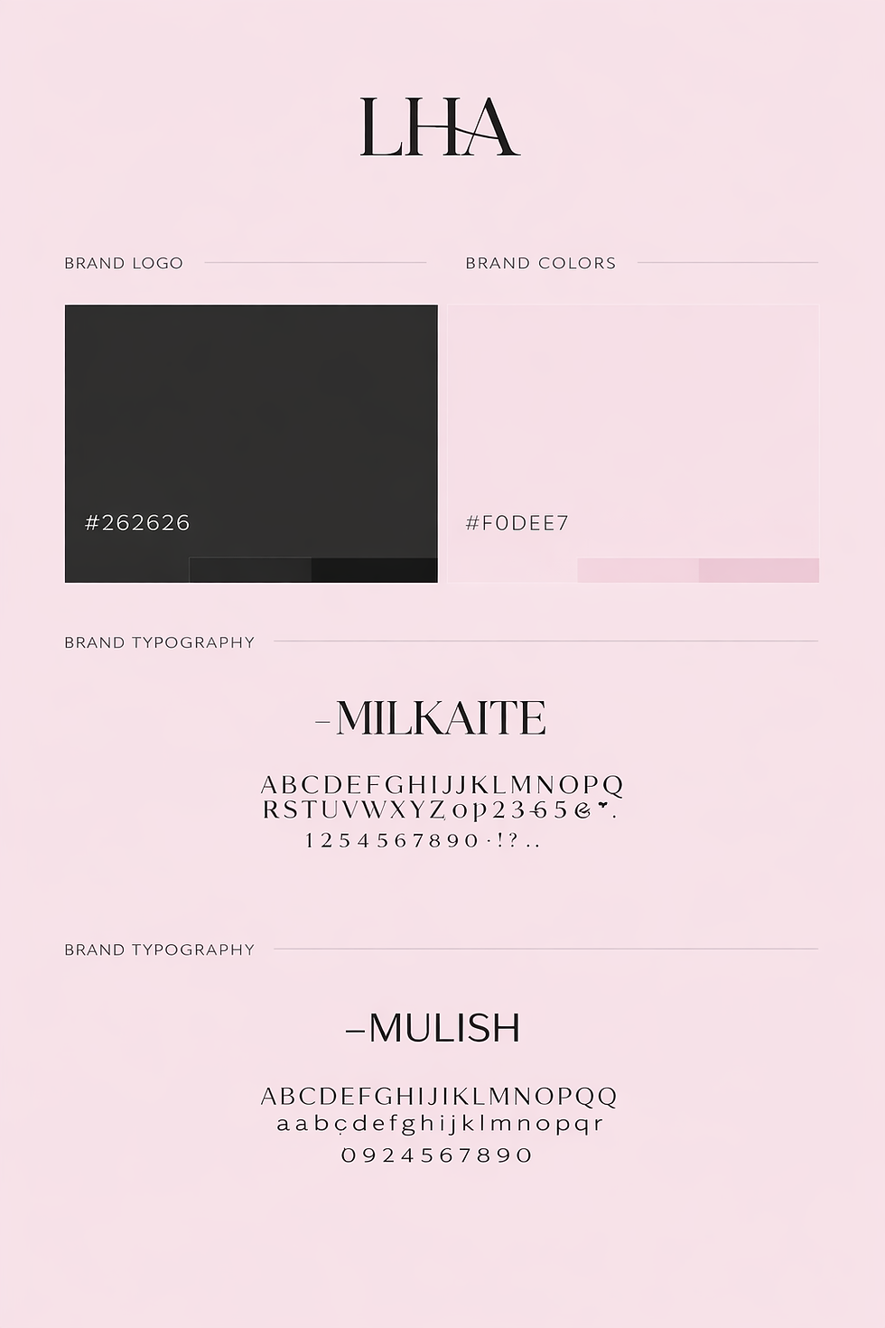
Lash Habit
Lash Habit, a leading fire prevention company, sought a rebrand to align its visual identity with its commitment to cutting-edge fire safety solutions. Our challenge was to create a modern and dynamic logo that conveys both strength and innovation.
-
Establish premium brand positioning in the competitive beauty market
-
Attract discerning beauty enthusiasts seeking high-quality lash services
-
Create cohesive brand experience across all customer touchpoints
.png)
Updated Color Palette
Updated color palette creates a cohesive, modern aesthetic that reinforces Lash Habit’s professionalism, confidence, and aspirational beauty brand.
Reimagened Logo
Business cards, appointment cards, loyalty cards, and stationery design
Brand Messaging
Refined brand messaging clearly communicates Lash Habit’s expertise, student outcomes, credibility, and leadership in beauty education.
Brand Style Guide
Comprehensive brand style guide ensures consistent visuals, typography, tone, and usage across all Lash Habit platforms.
Guidance through Grief
Guidance through Grief provides compassionate support services for individuals navigating loss. We approached this project with sensitivity, creating a brand identity that offers comfort while maintaining professionalism and accessibility for those in their most vulnerable moments.
-
Increase business revenue by attracting more customers
-
Convince customers that the brand can assist them with their fire prevention needs
-
Effectively market services by leaving a lasting impression through unique and memorable branding

Reimagined Logo
The reimagined logo symbolizes compassion, hope, and strength, reflecting Guidance Through Grief’s supportive and healing mission.
Updated Color Palette
The updated color palette uses calming tones to convey peace, trust, warmth, and emotional support.
Brand Messaging
Compassionate brand messaging offers clarity, empathy, trust, and steady support for individuals navigating loss together.
Brand Style Guide
Brand style guide establishes consistent visuals, tone, and typography to communicate compassion, clarity, and trust.
